How do our environments affect competency development?

I just got back from a rapid-fire three days at the annual #recitqc gathering. It is called the Formation conjointe et collaborative, which roughly translates to joint, collaborative training. Each year, it is three days where about 150 consultants in the recit network come from across Quebec to learn together. We organize workshops for and with each other and I love the conversations I get to have with my colleagues from all across the province about how we support teachers in their work.
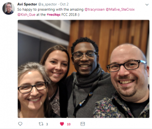
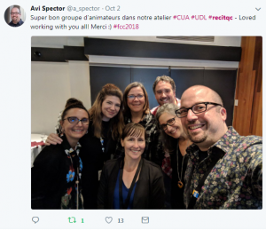
I also love the flexibility of the event. There are tons of workshops and social events scheduled, yet when I need a mental break, there are also many quiet spots scattered around the event venue where I can go to take a break or work quietly alone or with some colleagues.

It’s within this flexible structure that I can really feed and develop my own competencies as a consultant.

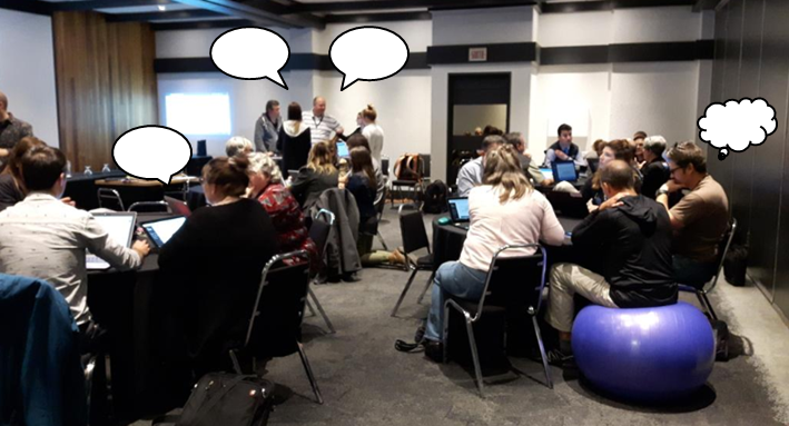
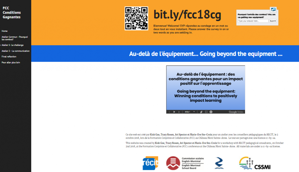
This year I had the opportunity to experience the FCC with a new colleague. We worked together with two others to create a flexible workshop that invited participants to think and talk beyond the new equipment that is coming into our centres under the rubric of the Digital Action Plan for Education in Quebec. It is easy to get caught up in the new, shiny tools so we invited participants to ask each other – what else is this digital action plan allowing us to do? How is teaching changing? How is learning changing?

Of special interest to me is how our teaching and learning environments – our classrooms – are set up to support competency development in our students (and ourselves!). We decided to include a standing table in our session and it helped to provide a welcome break from sitting as well as to redistribute the noise from multiple conversations across the space.

As I wrote earlier, I was able to benefit from the flexible learning environment at the FCC. Being able to find quiet spaces to think at different times helped me from getting overwhelmed by the activity and noise of many people learning together. Having a conversation station at the standing table in our session also allowed us to have a conversation above the noise of the other conversations in the room, which made communication so much easier.

How can we create similar conditions in our classrooms? I ask that question in this video (French & English versions) (Merci, Marie-Ève, pour la super traduction!)

If you are interested in pursuing these lines of questioning, all of what we did, including these videos as well as feedback from participants, will always be available at this website.
New E-book – Giving a Shift: Sharing classroom practice around change

Kish Gue (EMSB, youth sector), Avi Spector (RSB, adult sector), and I (CSSMI, adult sector) are excited to launch our new, self-published, e-book, Giving a Shift.

http://bit.ly/givingashift

In it, we describe how we organized a day-long workshop for teachers… a little bit differently. We describe what we planned and our intentions behind it. We also share images and videos that we took throughout the day as well as our reflections after the fact. Some of my favourite parts of our book are the videos of teacher testimonies taken throughout the day. They give me hope in the work I do.

Both the workshop and the book were labours of love for us and our hope is that it can inspire others as well! It is available here – please share with your colleagues and friends!

What technology do we need to get?

**Update: The digital action plan for education was released on May 30. You can read it here (in French). My understanding is that an English translation should be available in October. Keep posted for my (unofficial) synopsis of it in English in the near future.***

There is no one easy answer to that question. I’d say it depends, as does everything we choose for our classrooms, on our goals.

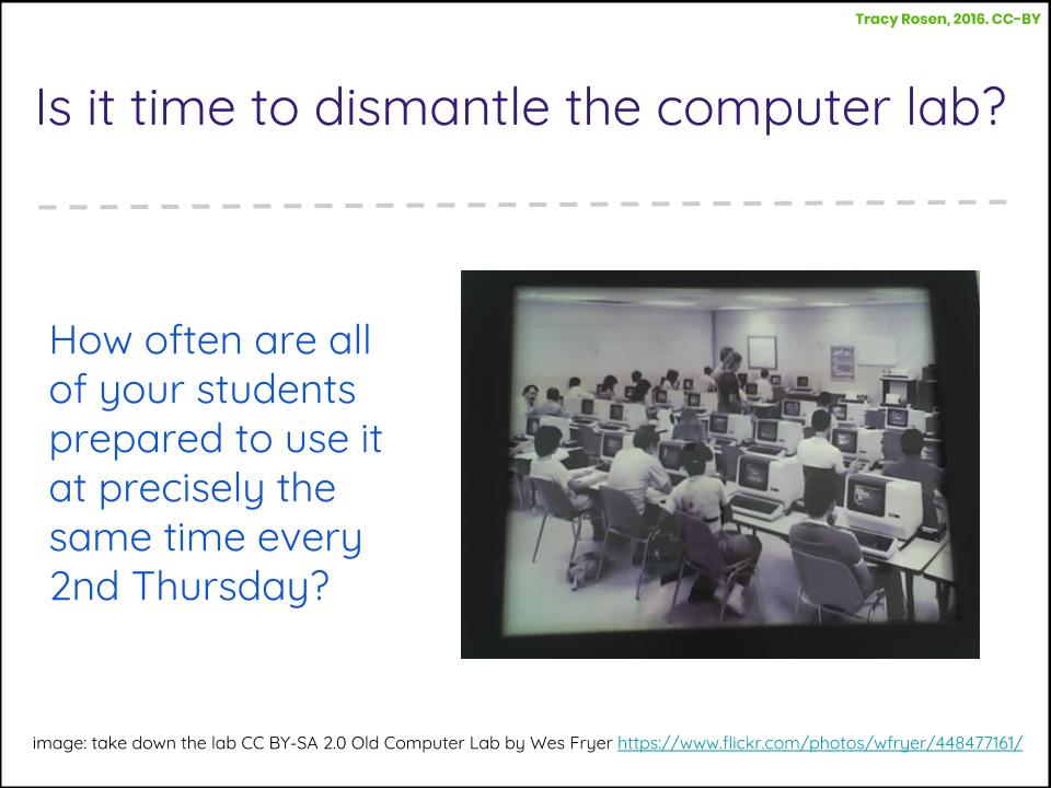
Right away though, I’d say DON’T buy a whack of devices to put in one room. Remember computer labs? **insert crickets here** I know that some schools and centres still have labs and when asked my opinion, I suggest to take them down and divvy up the machines amongst your classrooms.

Is it time to dismantle the computer lab? How often is everybody ready to use a computer at precisely the same time every Friday?

I would also warn away from putting all of your devices on a cart that needs to be reserved ahead of time.

Many of our schools and centres are moving towards flexible learning environments based on the principles of Universal Design for Learning – this requires flexible access to technology for learning, too.

The best use of technology is when it is available when you need it. If you redistribute the 20-30 computers that are in your computer lab, you can have a few per classroom. And if you have the luxury of purchasing some new devices (and we DO have that luxury this year in Quebec with our plan d’action numérique!) then you can add to those numbers. If you are contemplating a cart for devices (tablets, chromebooks, laptops…), I’d suggest to make sure that each classroom has some devices first and to use a cart for extra devices, when a group does need to all have a device at the same time.

What if each of your classrooms already has a number of devices? Then you may be interested in exploring some of the other items you can purchase to add to your curricula through robotics or open creative spaces. In fact, the only time I would suggest putting a lot of material into one room would be if your school or centre is in the process of developing a culture of shared collaboration and creativity through an open creative space (also known as a maker space). So that room would not be like a computer lab to go sit and do research or type a final copy of something but a room where students and teachers can learn together as they test out new ideas and create new solutions.

More than just a pretty space

A recent edsurge article talks about how the race to buy fancy furniture is turning flexible classrooms into a fad.

What then happens is instead of designing classrooms that positively impact students, we are decorating classrooms, celebrating the new, and then moving on to the next shiny thing. Pinterest-pretty classrooms bring instant gratification, but little else.
from: How Furniture and Flexible Seating Is Turning Classroom Design Into a Fad by Robert Dillon, Jan 4, 2018, on EdSurge

And that is true.

As I like to say – flexible classrooms are so much more than just a pretty space.

Flexible learning is so much more than just a pretty space

If we focus on good pedagogy and design our classrooms according to that, we can stay away from jumping on a fad that will soon disappear when we ultimately discover that it isn’t a magic bullet on its own, just like any number of other education fads – remember differentiation, flipped classrooms, multiple intelligences, teaching to learning styles, technology infused learning, *insert education fad here*…

But what is good pedagogy? Even the term pedagogy is thrown around so much that its become jargon.

I think that terms like pedagogy and ideas like good teaching and learning are fluid. My belief is that good teaching and learning need to be based on theory, yet are then made very personal as they relate to each teacher’s classroom and practice.

It is no secret to those who follow my writing here or who have been to my classroom or workshops, that I define ‘good pedagogy’ as access to learning for our students. And for me, that is closely connected to how we design our learning environments.

The way I see it, it comes down to these things:

As long as we keep our goals in mind when we begin to design our learning environments we are off to a good start – and these goals need to be strongly intertwined with whatever program goals we are committed to teach

Then, if we ensure that the largest number of our students can access these goals we are off to an even better start. We can do that by providing diverse resources, diverse ways for students to see the course goals, and examples of how we can achieve these goals (processes and strategies). Actually, it is not enough to just provide them. Explicitly teaching students how to access all of this (and/or getting out of their way when they figure it out!) is an important step.

I can’t just expect success to happen. I explicitly design for it.

Build it and they will come? No. We need to change the conjunction –> Build it SO they will come.

—-

My ideas are heavily influenced by this article by CAST as well as the experiences of teachers across Quebec, some are seen here: bit.ly/qcspace and on PD Mosaic – UDL + flexible environments. A special thanks to Avi Spector, of course – we explore these ideas together a lot!

Learning situations

Here we are, a few short months away from mandatory implementation of many of our new secondary 3 – 5 courses in Quebec Adult Education and I still find myself asking questions about learning situations. What about you?

My latest line of questioning had to do with the distinction between a learning situation (LS) and a learning and evaluation situation (LES).

Sonya Fiocco confirmed that the LES included some more formal evaluation components (for formative evaluation purposes, remember, our courses have 100% exams) where the teacher would want to track student progress compared to the end of course outcomes and provide them some tools for assessment, like ‘I can‘ statements or rubrics or criterion-referenced checklists.

Essentially, the LS and the LES are the same in terms of the content of learning. The E in the LES has to do with evaluation tools that are integrated into the learning context. And that these evaluation tools would be similar to those used for final evaluation purposes.

This is where my questioning became evident for me. As a teacher, I am always doing formative assessment. I can’t imagine putting my students in learning situations without assessment tools built in throughout the situation.

What about you? How are you implementing learning situations in your centres and classrooms? Is formative assessment always a part of your process? How (and when) do you know where students are in relation to the end of course outcomes?

Coincidentally, this morning I stumbled upon some old DevPro videos about learning situations from back when they were first being introduced to adult education with our Common Core Basic Education (CCBE) programs a number of years ago.

Here they are – you may recognize some of the speakers! (If you are reading this in your email inbox, please visit the blog post via the link at the bottom of the email to see the videos. Thanks!)
The 3 Rs of a learning situation

The anatomy of a learning situation

The learning situation pretenders.

What is an LES? Avi’s take.

What is an LES? Marc-André’s take.

The LES: one way to stimulate learning

A note on keynotes

Do big conferences still have keynote speakers because it is what has always been done?

We talk about the prime real estate in our classrooms – how the start of any period of learning sets the tone for the rest of the day, at times, the rest of the year. So why don’t we apply this to our professional learning as well?

I have been to a number of conferences and most of them have one thing in common – the keynote speaker. After a few minutes into a keynote presentation I usually look around at everyone in the room and think: What an opportunity we have here! …If only we could all connect with each other right away. Recently, I was at a conference with hundreds of teachers, consultants, and administrators from primary, secondary, and adult education centres across the province of Quebec. The keynote was interesting for about 20 minutes and then… people started fidgeting. The woman across from me was playing candy crush. The person next to me was reading the upcoming workshop descriptions. You get the picture.

Conference organizers spend a lot of money getting big-name keynote speakers. WHAT IF we reframed the keynote?

A keynote is supposed to energize participants and get them primed for the learning to come. WHAT IF we focused our energy on finding great workshop facilitators and asked one or a handful to energize participants for 20 minutes? We know that the shorter, and more concise the message, the more potential there is to light a fire and to keep us wanting more.

There is nothing worse then getting all excited about going to a conference, hearing all of that buzz in the lobby of the conference centre as people see colleagues they haven’t seen in a long time or meet others for the first time…only to have that energy quashed by sitting on plastic chairs and listening for 45 or 60 or 90 minutes. Think about it – so many initiatives in education are moving away from lecture based teaching and learning… so why are we modeling this kind of learning in education conferences?

WHAT IF we limited our keynote presentations to 20 minutes? And if keynote presenters were forced to use technology in ways that make sense for learning by using powerful images with simple bits of text to support what they were saying?

Think of the potential for igniting our excitement for learning and for harnessing that valuable real estate at the beginning of a learning cycle. If a group of people are gathering in one place to learn together, is the best way to launch the learning through…lecture?

Some questions about digital portfolios

This post starts of with a personal experience and ends with a series of questions for adult educators.

Last week, while I was at a conference focused on our new programs in Quebec adult education, I received this via a portfolio app called SeeSaw that my son’s teachers use to share news from the classroom.

image of dictee with red pen corrections and stickers

I usually love to see pictures of him working on different projects or singing songs but this image affected me differently. After a few days, I sent a message to his teacher to let her know this (I shared this article with her before publishing it).

I was thinking, Way to go, Jack! at the same time as I thought about all of the work I have been doing with teachers and consultants over the past number of years to move away from the celebration of weekly quizzes, at the same time as I thought about the role of educational technology and how this app brought this image to me along with all of what I just described.

I love the idea of digital portfolios. I have my own all over the place, most recently here:

image of portfolio webpage, click to access

Jack even has one that I started for him and that he added to through most of Kindergarten.

As a technology consultant, I love the premise of using technology to share learning with others. One of my central beliefs about the use of technology has to do with its power to share our stories. I love seeing pictures of Jack during the day, they lift my heart. But when this picture came in, it didn’t have the same effect.

One of SeeSaw’s selling points is that “Seesaw gives families an immediate and personalized window into their child’s school day.” (from their website).

Do we need this? Is this what a portfolio is?

If I wanted an immediate and personalized glimpse into my child’s school day… shouldn’t I be homeschooling?

Part of it is that I just don’t celebrate weekly tests and quizzes. Especially when I received this image completely out of context, in the middle of the day, while I was at a conference in another city. And I guess that is it. A system like SeeSaw doesn’t really give us a personalized window into the school day. It gives us tastes, as determined by the teacher.

A big part of it is my own fault for not changing the settings on the app. I now have it set to notify me only once a day for any updates. (Not sure what time of day that is, guess I will find out!)

I know that some of you have used apps like SeeSaw with adult students – either in adult ed or higher education. What do you feel about it? What do your students feel about it? Do you find that it gives you more work? Are you using it in ways that encourage students to self-assess? To assess their peers? To assess their teachers? What is amazing about it? What are its downfalls, if any? Have you ever received feedback like what I just wrote?

And what is our responsibility as educators when we use apps to share things with our students and their families?

I don’t claim to know all of the answers. This is a new line of questioning for me. Help me out.

Designing your space to match your goals

My last post was called the magic of flexibility but really, the magic is a result of very careful planning.

The first sentence to go through my mind when I plan a learning session with teachers is ‘Design the space to match the goal‘ (see CAST, 5 UDL tips for learning environments). If I want participants to talk, I need to make sure that I set up a space that facilitates conversation. If I relate this to the classroom, and I want my students to talk to each other, then I have no choice but to set up my classroom space in a way that makes conversation a part of the learning.

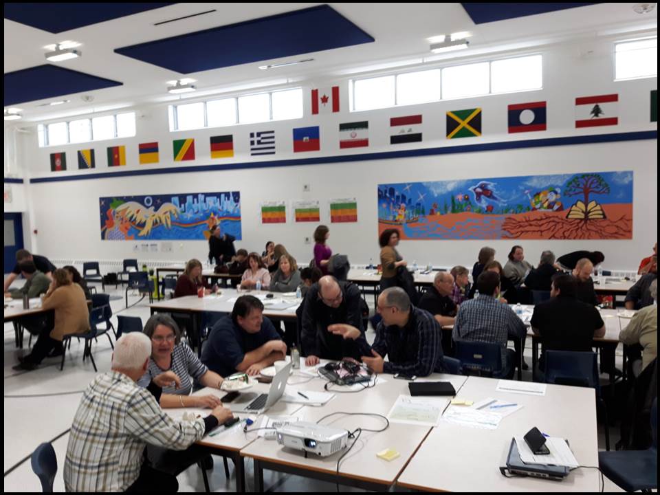
Yesterday, Avi and I were working with about 50 teachers and administrators of the Western Quebec School Board on Universal Design for Learning (UDL) and flexible learning environments. Our space was given to us – a gymnasium. So there was plenty of room for us to set up our stations and for the participants to comfortably move through them throughout the morning.

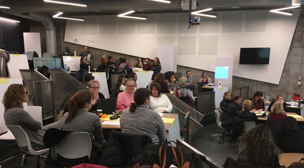
In conversation with one of the teachers at lunch, she remarked on how loud the room was and she compared it to a PD session we held at McGill University the month before called Designing Engaging Classrooms. There were over 100 people having conversations in one room at McGill and she commented on how it was far less noisy in that room than it was in the gymnasium and that it must have been engineered specifically for better acoustics (which it was). So I looked at pictures of the room to see how we could recreate this effect in our public school spaces – like gymnasiums and classrooms – when our goal is to facilitate conversation.

If you look carefully at the image, you can see that the tables in the active learning classroom at McGill are on different levels so conversations happen on different levels within the space as well.

McGill active learning classroom, redistribution of sound over levels

picture of McGill’s active learning classroom in the Education building taken by Jovette Francoeur, posted on Twitter. Click on the link to see the full tweet.

The tables in the gymnasium are all at the same level, so the sound from the conversations stays at the same level as well.

January 11, 2018 WQSB

PD hosted in the gymnasium at Hull Adult Education Centre, picture by Tracy Rosen

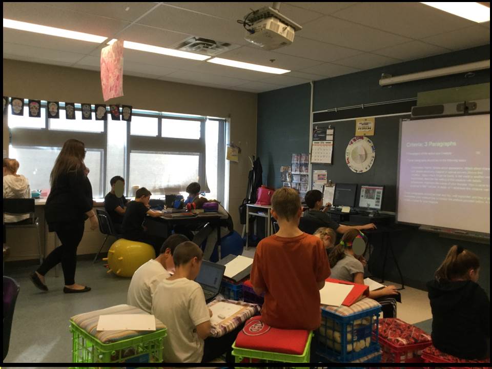
I remember Tom Rhymes, Director of Educational Services at LBPSB, talking about how classrooms were less noisy at Forest Hill Senior Elementary School since the teachers started to design different seating levels in the classroom – from lower milk crates, to chair level, to standing desks – and this resulted in a redistribution of the sound in the room.

forest hill class levels

classroom at Forest Hill Sr., picture taken by Avi Spector

What can this look like in Adult Education?

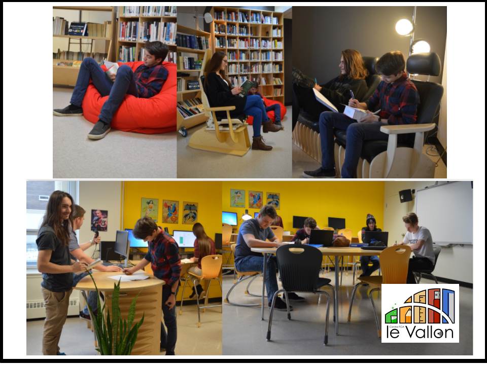
At the Centre le Vallon in Papineauville, Nadia Veilleux has carefully designed her classroom with different seating zones for her students. The result is an example of how we can use different levels of seating with adult learners to better manage conversation levels in a room.

Seating levels at Centre le Vallon

pictures by Nadia Veilleux, Centre le Vallon, Commission scolaire au Coeur des Vallées. Click on the link to see a video about her classroom (en français)

And finally, when we model flexibility, participants are encouraged to be flexible in their own approaches to learning as well. Take a look at how one of the groups at Western Quebec School Board dealt with the noisy gymnasium… they created their own quiet oasis in the space.

Follow #qcspace on Twitter for more on Designing Engaging Classrooms at McGill (Dec 12, 2017), Flexible Spaces and Adult Learners at WQSB (Jan 11, 2018), as well as other UDL and flexible learning environment initiatives in Quebec.

Here are some highlights from those events:
#QcSpace Dec 12, 2017
#qcspace at Western Quebec School Board, Jan 11, 2018

The #qcspace website updates as new resources are created across the province, so visit it often!

You can also visit PD Mosaic for even more Made in Quebec resources on UDL and Flexible learning environments.

The Magic of Flexibility

(if you are reading this in your inbox, please go see the original article on PdPractice in order to see the videos and other media. Thanks!)

Last Friday, Avi Spector and I facilitated two very intense professional learning sessions with two very different groups of teachers in two very different parts of town.

On a Friday.

When I started the day, I felt exhausted and thought to myself – 8 hours until the weekend! But by the end of the day I felt invigorated. THIS is the magic of working in stations and offering flexible opportunities for teachers to talk about what matters to them. If I had gone in there to present a fancy slideshow, I would have ended the day even more tired from talking all day long.

Listening to teachers talk, watching them interact at different stations, seeing them use technology as par for the course, and hearing their feedback on the different activities, such as this reflection activity using flipgrid, was absolutely inspiring and affirming.


Click here to view the full grid

Friday’s sessions were two in a long line of different PD opportunities since August. Each of them represent another chapter in this year’s story about learning environments. More and more, both Avi and I are examining how we embed the principles of UDL (Universal Design for Learning) in what we do as we redesign our professional learning environments. Because – if we want to see this in our classrooms, we want to model this in our PD. I believe that, deeply.

So here are some highlights from various sessions since August.

We arrive early in order to set up our space. We want to model flexible learning environments that include different stations to facilitate small working groups as well as opportunities for personal learning & reflection. The stations tend to look something like this:

  1. Design Station: a station where teachers are invited to design a learning space, choosing specific design criteria from a booklet of 3 different choices. Sometimes we ask teachers to take pictures of their spaces and share them at the teacher station or on twitter.
  2. Resource Station: a station where teachers can view different resources on PD Mosaic and other platforms, and write or talk about what they learned. We usually offer a lot of choice here, so people can choose the resources they view.
  3. resource cards to choose from

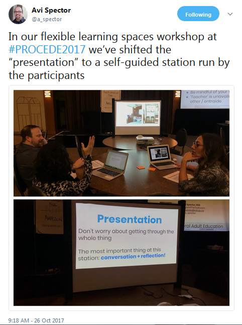
  4. Presentation Station: a station where teachers guide themselves through our presentation and have a discussion or take notes about what they view (we usually have a presentation, we just don’t present it ourselves!). I learned this strategy from Natasha, a teacher in one of our adult centres.
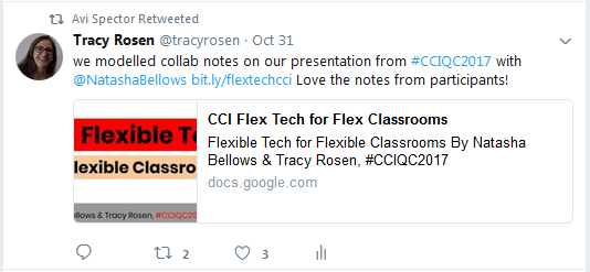
  5. tweet about collaborative presentation notes

    presentation station

  6. Reflection Station: a station where teachers can reflect and respond to different prompts. Sometimes it is an article or a set of questions. Sometimes the reflections are done individually or in pairs. We are starting to use flipgrid to structure these responses.
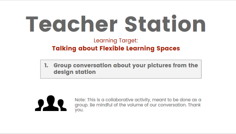
  7. Teacher Station: a station where teachers can talk to the workshop facilitators about any ideas or questions that come up from the other stations. In the classroom, this would be a great place for some conversation-based formative assessment.
  8. An instruction card from one of our teacher stations.

    teacher station instruction card

Here is an example of what our spaces might look like before we set them up:

And this is what our learning environments tend to look like once we set them up:

We are very intentional in our planning for these kinds of workshops. We design each one based not only on our subject matter but we want to make sure we differentiate our content and activities so that each of our participants can access what we are offering to them according to their comfort level and background knowledge.

To help us do that, we cycle through these orientations, adapted from CASTs 5 tips for designing learning environments:

Design the space to match the goal

Provide resource areas that everyone can access (This includes technology & digital resources)

Make learning processes visible in your environment

Make learning goals visible in your environment

In my next article, I will write about these orientations in more detail. They are becoming super influential in how I approach the learning environments in which I work.

Learning Environments + Professional Learning: Updates

autumn image of leaves from pixabay How has your fall been? Everyone I talk to lately agrees that this fall seems even busier than ever. At first, I thought this was just in Adult Education since we are implementing a ton of new programs this year but I am hearing this from people in multiple sectors and I am starting to think that has something to do with a growing shift to re-examine teaching and learning within the context of our learning environments.

As I wrote in my first blog post of the year, I am looking closely at learning environments and the role they play in learning, in using technology while we teach and learn, and in changing how we offer professional learning opportunities to teachers.

The more I work with teachers, the more I realize that when we start to consider our environments of learning, the closer we are getting to ensuring equal access to learning for our students. And THAT makes me super happy!

Here is a quick look at some of the professional learning opportunities and resources that Avi and I have developed over the past month or so. You can click on the images to visit the different resources if you like. (direct link to the document: http://bit.ly/recitoct)